Blessing Lantern — Fu Character and Gourd

Blessing Lantern — Fu Character and Gourd
A blessing lantern built around a written character is one of the few pieces in this range where the design problem is legibility rather than shape. A dragon can be stylised freely and still read as a dragon. A character…
A blessing lantern built around a written character is one of the few pieces in this range where the design problem is legibility rather than shape. A dragon can be stylised freely and still read as a dragon. A character cannot: if the strokes blur into each other, the symbol stops being a symbol and becomes a pattern, and the whole point of the piece is lost. This page is about how that is solved, how the gourd that frames the character is built as a lit structure with its own interior, and how the gold that finishes it is kept from turning the whole display into a floodlight.
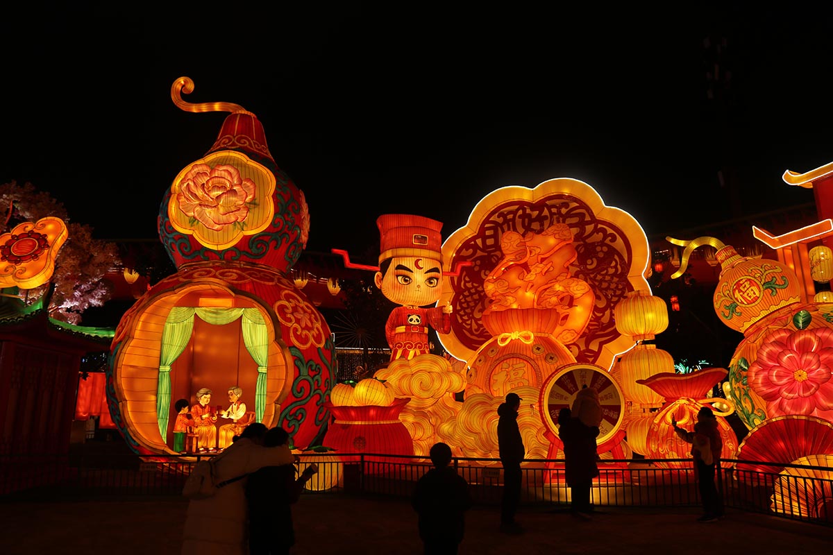
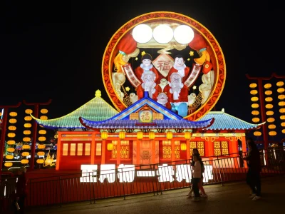
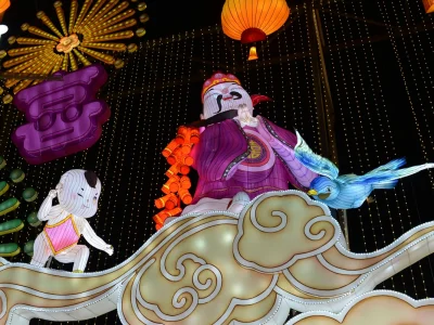
The scene is built as a layered structure: an oversized gourd lantern with a cut-out shell, a lit interior scene visible through the openings, a figure in traditional dress beside it, and scrollwork, peony and cloud elements arranged around the base. The character is built as a structural element in its own right, either on the gourd face or on a freestanding panel, with the lighting resolved so that the strokes stay distinct at viewing distance. Painted surfaces carry a UV-resistant treatment, and all electrical components are outdoor-rated on low-voltage runs.
Why a character is the hardest thing to build in a lantern
Lanterns are made of silk stretched over a frame, and silk glows. That is the whole appeal of the craft, and it is also why written characters are difficult: a character needs edges, and a surface that glows from the inside softens every edge it has.
Three things go wrong, in order of frequency:
- The strokes bloom. Light passing through silk spreads sideways within the fabric, so a stroke that measures 10 cm on the workshop floor reads wider and blurrier at night. Fine strokes lose each other first, then the whole character closes up.
- The junctions fill in. Where two strokes cross or meet, the local brightness doubles and the gap between them closes. On a complex character this is where readability dies, and it happens before the strokes themselves fail.
- Decoration eats the negative space. Peony motifs, cloud scrolls and golden borders added as embellishment are usually drawn into the gaps between strokes, and those gaps are exactly what makes the character readable. Embellishment has to live outside the character’s field, not inside it.
The practical rule for stroke width is the one worth designing to: a stroke has to stay continuous at the furthest distance the visitor is meant to read it from. As a working starting point, a character around 3 m tall wants strokes of at least 8 to 10 cm, and wider for anything finer than three strokes in each direction. Built below that, the piece looks correct in the workshop and unreadable on site.
Light through, or light behind: the readability decision
There are two ways to build a character, and choosing between them is the first decision on any project of this kind. They are not interchangeable.
| Approach | How it reads | Best for |
|---|---|---|
| Strokes opaque, background lit | Solid characters against a glowing field. Edges stay sharp because the contrast is between a dark element and a bright one. | Legibility at distance; complex characters; any piece where reading the character is the primary job. |
| Strokes lit, background dark | Glowing characters on a dark surround. Warmer and more decorative, but the strokes need internal room for the light source. | Simple characters with bold strokes; pieces where the character is a glow element rather than a message. |
| Both lit | No contrast. The character disappears into a bright panel. | Nothing. This is the failure case. |
The choice also drives the structure. Opaque strokes have to be built from a material that genuinely blocks light — a solid panel or a dense opaque coating over the silk — and the glowing field behind them has to be lit evenly, because any hot spot behind an opaque stroke shows up as a patch of brightness bleeding around it. Lit strokes, on the other hand, need the armature of each stroke to be hollow enough to carry a light run and the wiring between strokes, which makes the frame heavier than it looks and puts a limit on how fine the character can be.
On most large blessing pieces the first approach is the right one, and the reason is practical rather than aesthetic: complex characters are common in this subject, and opaque strokes are the only version that survives the junction problem described above.
The gourd as a frame: nesting one scene inside another
The gourd is more than a shape. In this composition it is a container, and the design interest comes from the fact that it has an inside — a small family scene or a table setting visible through cut openings in the shell, so the visitor is looking into the lantern rather than at it.
Building that properly takes four decisions:
- The openings have to be large enough to see through from the viewing distance, not from close up. A visitor at eight metres sees only a fraction of what a visitor at one metre sees. Openings sized against the close view produce a piece where the interior detail is invisible to almost everyone who walks past it.
- The shell needs thickness at the openings. A single layer of cut silk reads as a sticker applied to a surface. Two layers with the inner layer cut slightly smaller gives the opening a visible edge, and it is that edge — not the cutout itself — that makes the shell read as a shell.
- The interior has to be brighter than the exterior. If the outside of the gourd is the brightest surface, the openings read as dark holes and the interior scene is lost. Lifting the interior slightly above the shell luminance is what draws the eye inward.
- The interior needs to be finished from every angle the openings can be seen. Because the cut-outs are usually on more than one face, the inside of the shell is visible from several directions, and cable, drivers and armature have to be concealed from all of them rather than from the front only.
The same principle governs the decorative elements around the piece. Clouds, peonies and scrollwork at the base are not there to fill space — they are there to give the gourd a ground plane, so that it appears to sit in a setting rather than float on the grass.
Gold, and how fast it turns into a floodlight
Gold is the most over-used colour in blessing pieces, and the reason is that it behaves badly at scale. Gold is a high-lightness colour with little tonal range, so a large gold area under warm light does not read as gold — it reads as a bright surface, and it flattens everything around it.
- Keep gold to edges, characters and small motifs. Gold on a border, on a character and on scattered floral accents reads as gold. Gold across a whole panel reads as an illuminated wall.
- Use red as the ground and let gold sit on top of it. Red gives gold something to work against. Where gold sits on gold, the piece loses all its modelling and looks flat from every angle.
- Keep green strictly for foliage. Green entering the main body muddies the red-gold relationship immediately; restricted to leaves and stems it separates them cleanly instead.
- Do not light gold surfaces directly where they face the visitor. A gold surface lit straight on produces a bright patch with no detail. Slightly off-axis lighting keeps the surface reading as metal.
The character is where gold earns its place. Outlining a character in gold against a red ground gives it a hard edge that also improves readability — the same edge that a dark stroke provides in the opaque-stroke approach, working from the other direction.
Upright or inverted: a cultural decision to confirm before production
The character in this subject is traditionally hung inverted as well as upright, and the two carry different readings — the inverted version is a deliberate play on words that is understood as an arrival or a wish granted. Neither is wrong, but they are not interchangeable for every client, and the choice has to be confirmed at the design stage rather than discovered at installation.
Practical handling:
- Ask which orientation the venue expects rather than defaulting. Where the piece is commissioned for a specific cultural event, the organiser usually has a view, and a single question at the drawing stage removes the risk of an argument on site.
- On freestanding panels, build the character as a replaceable unit. Making the character a mounted element that can be turned or swapped lets a venue run it upright for one event and inverted for another without rebuilding the piece.
- Keep the surrounding motifs orientation-neutral. Peonies, clouds and scrollwork should work in either arrangement so that turning the character does not leave the rest of the composition upside down.
Where a blessing piece works outside the New Year window
Blessing pieces are usually commissioned for Spring Festival, and they frequently end up unused for the rest of the year. That is a waste of a structure, because the symbol is a general one.
- Opening and anniversary events. The character is a standard element at openings and celebrations, and the piece works as an entrance feature with no seasonal reference at all.
- Interiors and atriums. In mall and hotel settings the piece runs all year, since the lighting conditions are controlled and the warm red-gold palette reads well against interior finishes.
- Cultural exhibitions and heritage programming. As an exhibit the piece carries explanation with it — the symbol, the gourd, the family scene and the decorative vocabulary all have documented meanings that can be interpreted alongside it.
- Mid-autumn and other festival windows. The repertoire of motifs overlaps, so a blessing piece can be adapted for a second festival season by changing the accompanying elements rather than the main structure.
Specifications
| Attribute | Details |
|---|---|
| Character height | Typically 1.5 m – 4 m, sized against viewing distance and stroke width |
| Gourd height | 2 m – 4 m, with cut openings and an internal lit scene |
| Composition | Gourd, character, figure in traditional dress, peony and cloud elements, scrollwork base |
| Structure | Weatherproof metal armature; silk over frame; layered shell with concealed openings |
| Lighting | Low-voltage outdoor-rated LED; opaque strokes against a lit field as the default legibility approach; interior scene lit slightly above the shell |
| Palette | Red ground with gold edging and character outline; green restricted to foliage |
| Materials finish | UV-resistant painted silk; CE / UL electrical components |
| Weather rating | Outdoor-rated, with interior lighting and drivers accessible from a service hatch |
| Applications | Spring Festival and Chinese New Year settings, openings and anniversaries, mall and hotel interiors, cultural exhibitions |
Frequently Asked Questions
Related Products and Designs
Other symbol-led Chinese pieces: the fortune bag lantern, the mandarin duck pair, the lion dance gate and the giant golden dragon.
Pieces that work as an entrance feature: the pagoda lantern, the star lantern arch and the walk-through corridor. Wider ranges are on the festival lanterns pages.
Send the character, the intended orientation, the viewing distance and the setting through the contact form, and we will return a layout with stroke widths and interior openings resolved.

You May Also Like
Related Products
Cultural Lanterns
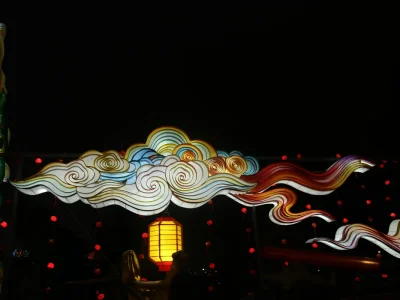
Cloud Motif Lantern Archway — Auspicious Cloud Span with Ruyi Crest
View Details →
Questions
Frequently Asked Questions
Interested in This Product?
Get a custom quote within 24 hours. Our team is ready to help.